project overview:
This project began with the goal of creating a unique, engaging way of exploring the entire
collection at the Williams College Museum of Art (WCMA).
Ordinarily, visitors will have little to no exposure to objects in the collection that are not on display at the time of their visit.
Not only can objects in a current exhibit be seen in the physical museum space, but they are often the most prominently displayed on the
museum webpage for digital visitors, as well. This leads to many "hidden" pieces going unnoticed for long periods, and is compounded by the
fact that more recognizable collection pieces tend to be part of exhibits more frequently than their lesser-known counterparts.
If a digital experience of the museum's collection is not arranged in relation to featured works, what else could it be based on?
WCMA's search functionality already allows pieces to be found based on metadata, but this, like many such organizational schemes,
requires the user already have some idea of what they are looking for. This is good for searching, but not so great for exploring.
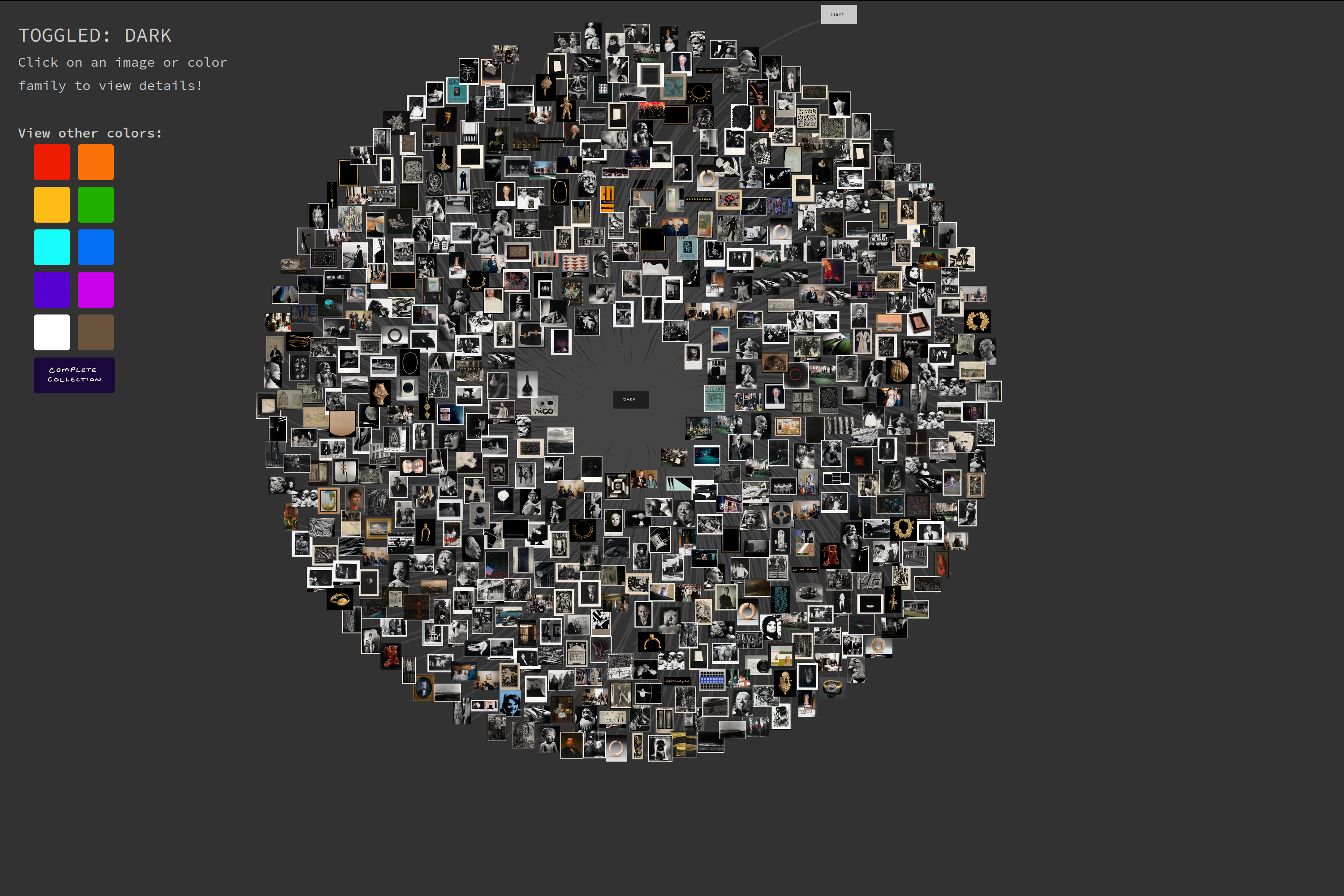
By contrast, color lends itself well to exploration, and brightness adds one additional level of filtering. By selecting a color and brightness
classification, users can see all pieces that belong to that type. This makes every piece visible to the user, providing a grand overview of all collection objects and promoting no piece over another.
From here, users can "zoom in" and see detailed information about any of the individual pieces.
For more information, read notes on design and information decisions here,
an informal history of the development process here,
project code here, or look below to dive in to the collection!
Special thanks to my advisors,
Iris Howley and
Beth Fischer.
functionality overview:
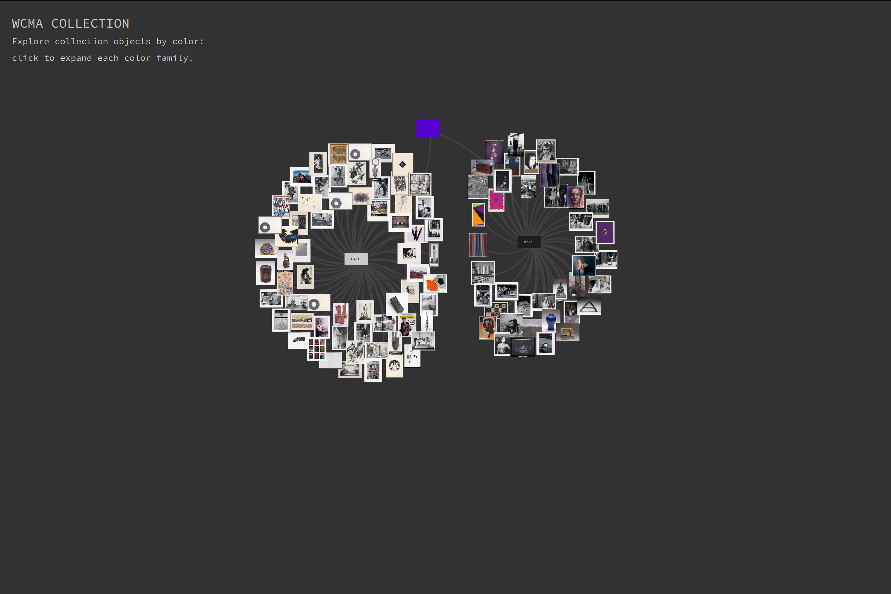
To start, select one of the 11 color families. Every single object in the collection can be found in one of these pages. If you
select any color other than sepia, you'll see a graph based structure, where each of the nodes is a picture of a collection object:
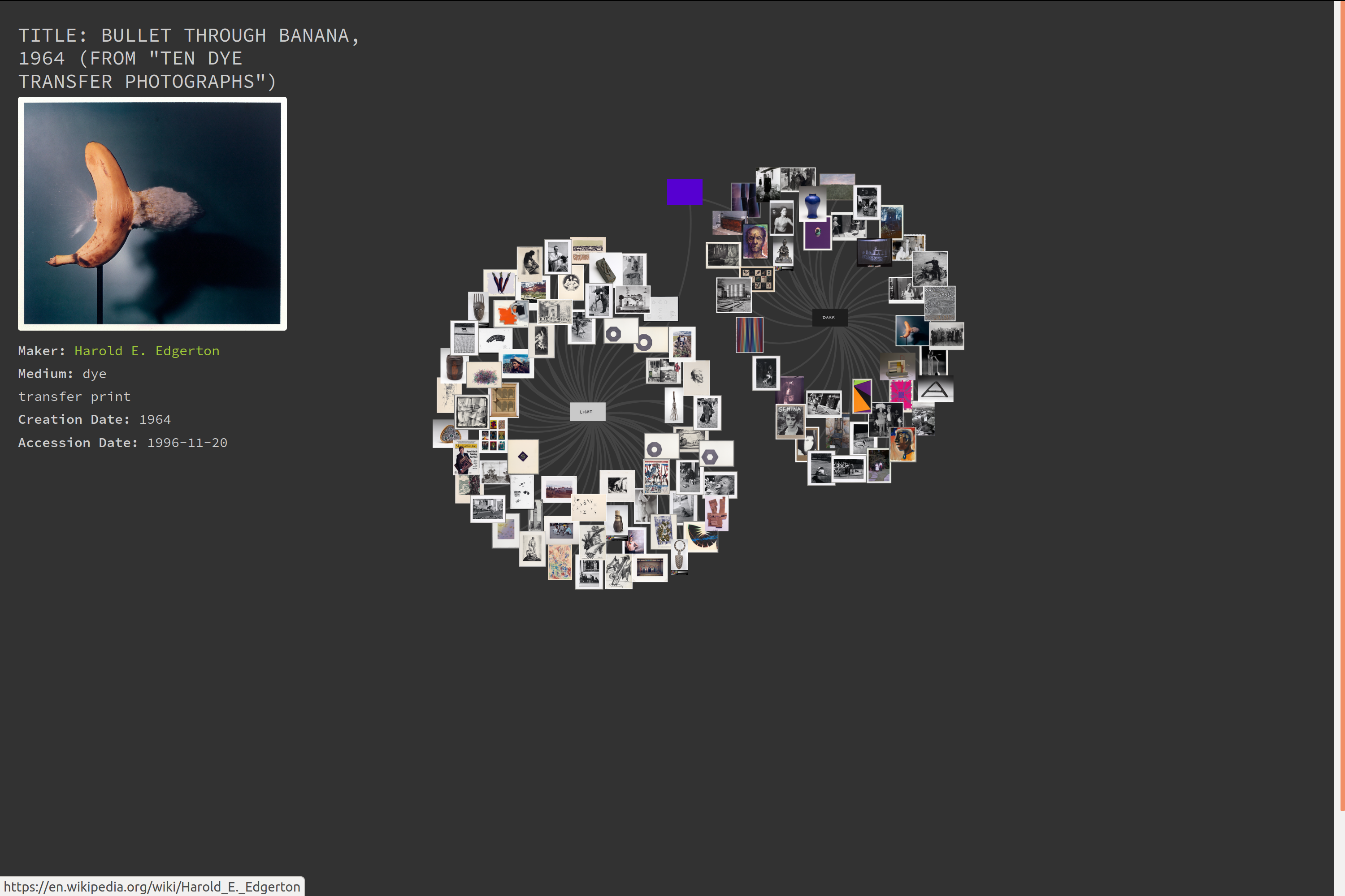
Click on any image to see details about the object shown. Also try clicking on the artist name, which links to a wiki page:
The display is best viewed with only one of the brightness sections expanded (there are two, "light" and "dark"). Click on
either the "light" or "dark" tag to toggle the visibility of that group, or on the main color tag (the central node) to toggle
the visibility of all icons.
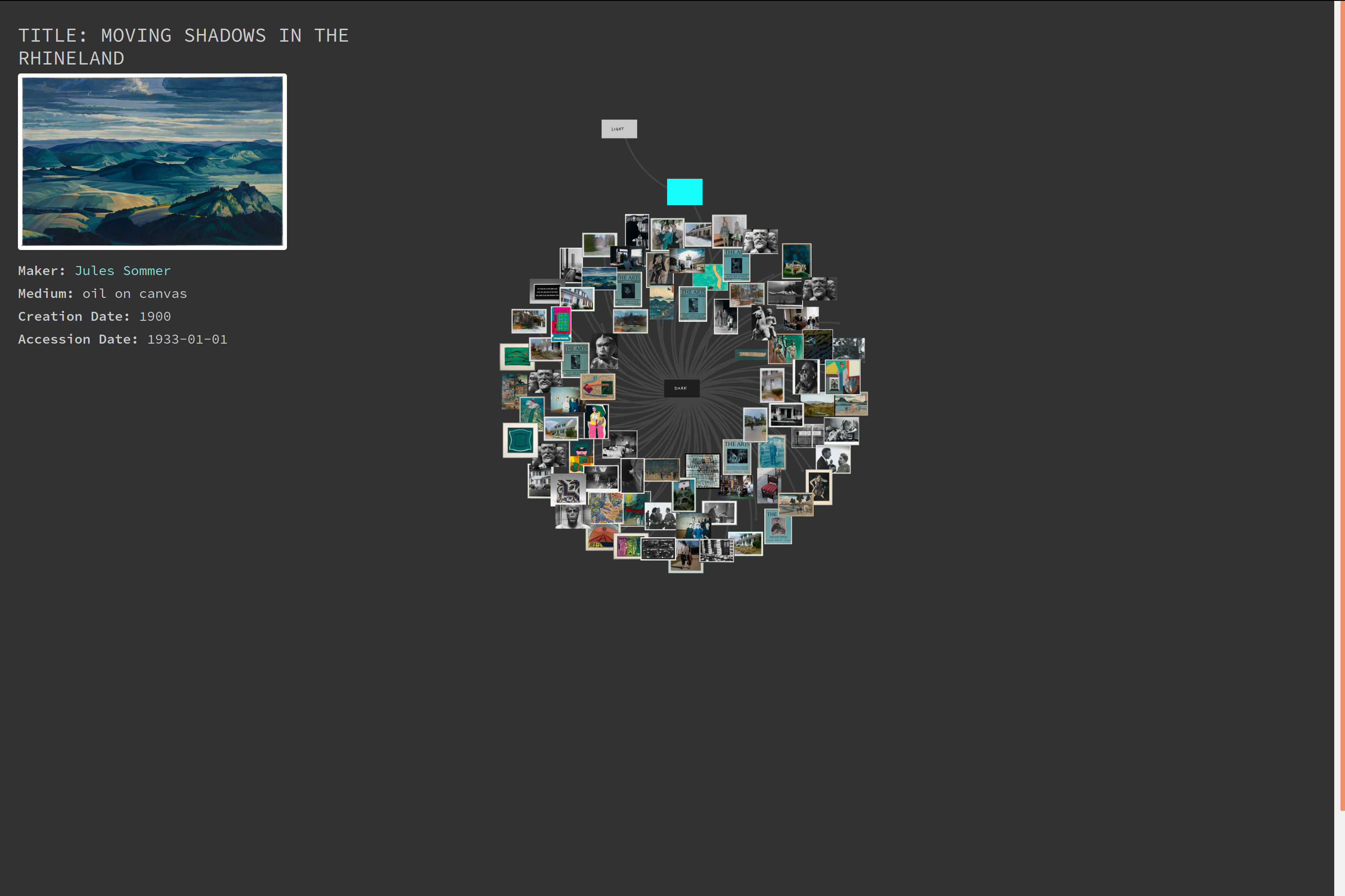
Clicking any of these nodes expands the selection panel, from which you can navigate to any other color group or back to the
main home page:
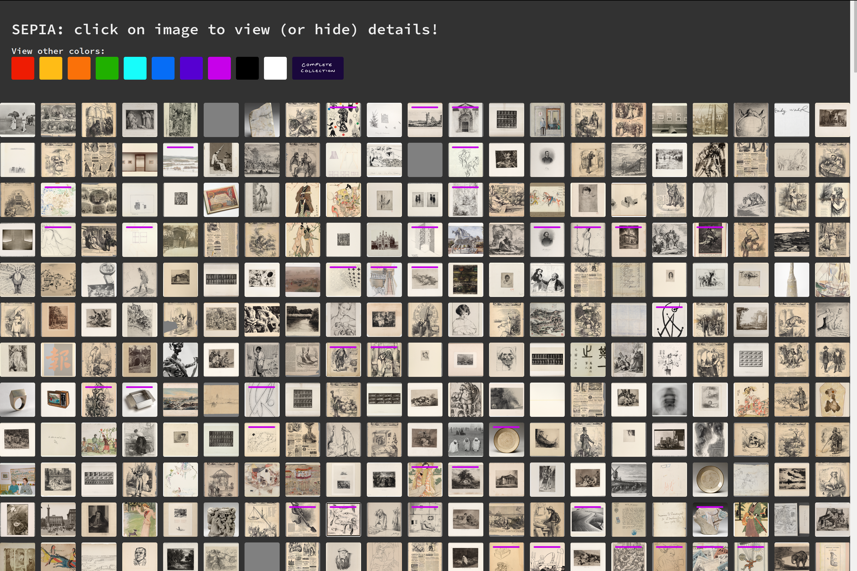
SEPIA:
The sepia page follows a grid layout, since there are so many sepia-toned pieces! Clicking an image displays the image details,
and marks the opened image on the grid with a small magenta mark:
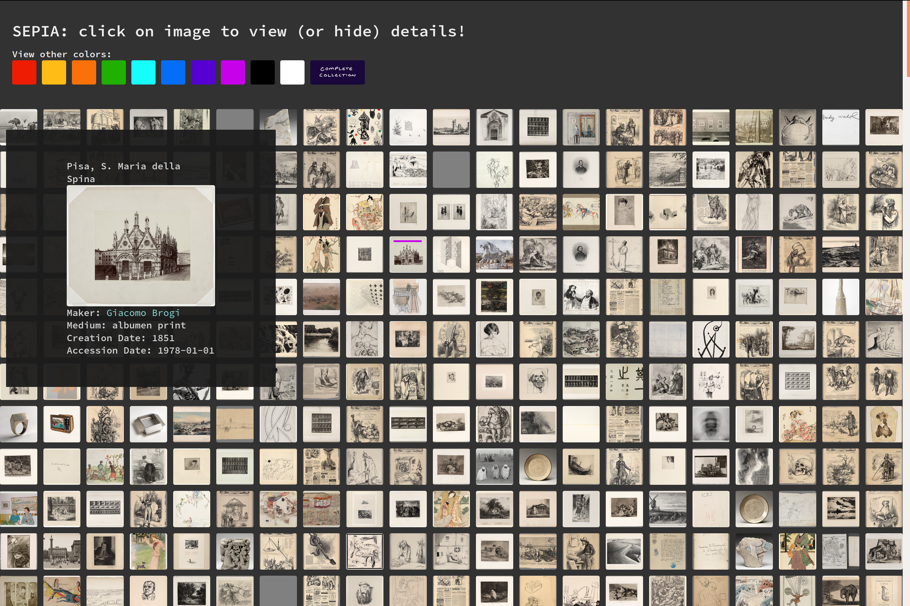
Clicking the same image or the details pane closes the expanded panel, so that the entire grid once again becomes visible. The magenta mark remains on the
grid to indicate which images have been visited: