This week I focused on analyzing the colors for each image in the collection. There are several options for doing this, and I ended up using k-means clustering. Essentially, this method allows for finding the dominant colors in the image. This differs from just finding the average color composition of an image, as with this latter method, the result would be a muddle of colors that might not reflect any of the colors in the image at all. For a multi-colored image, finding the average color would likely yield a shade of brown.
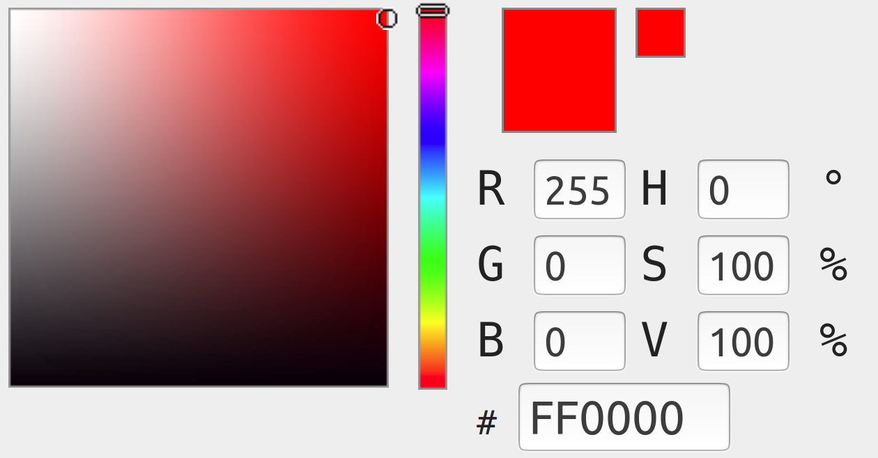
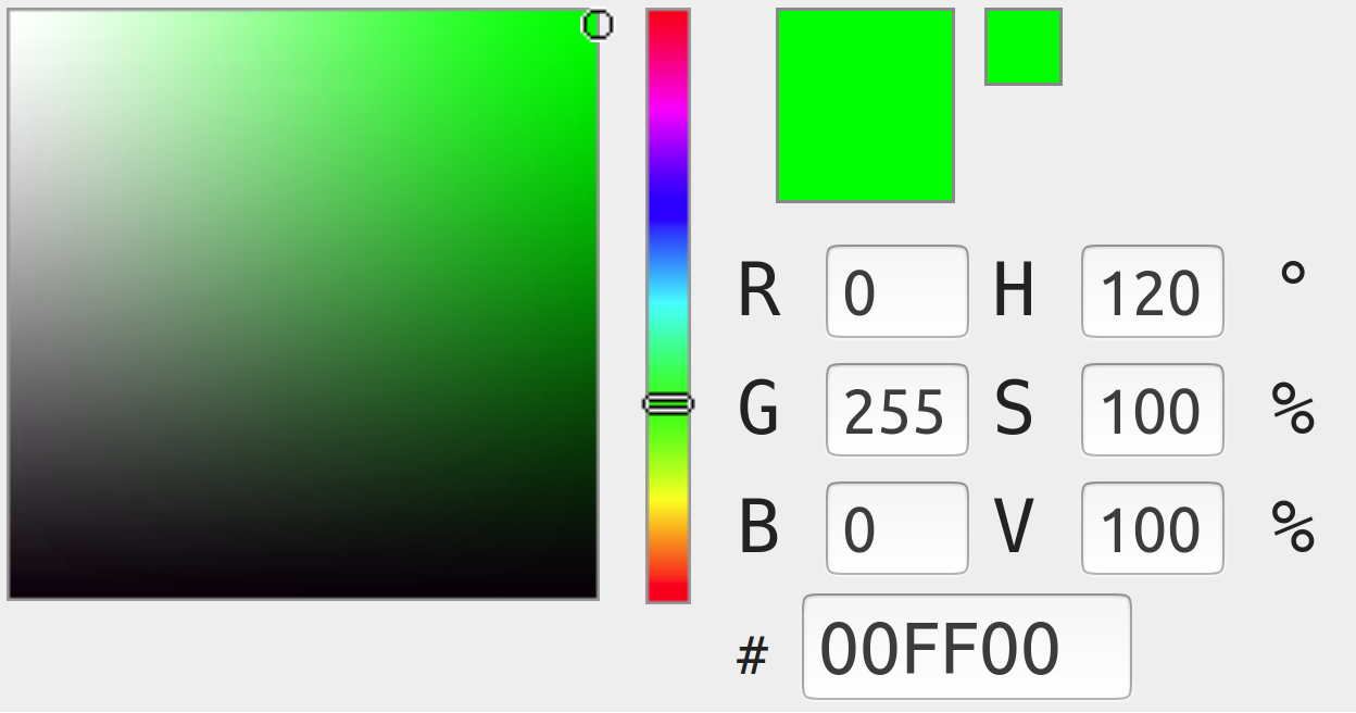
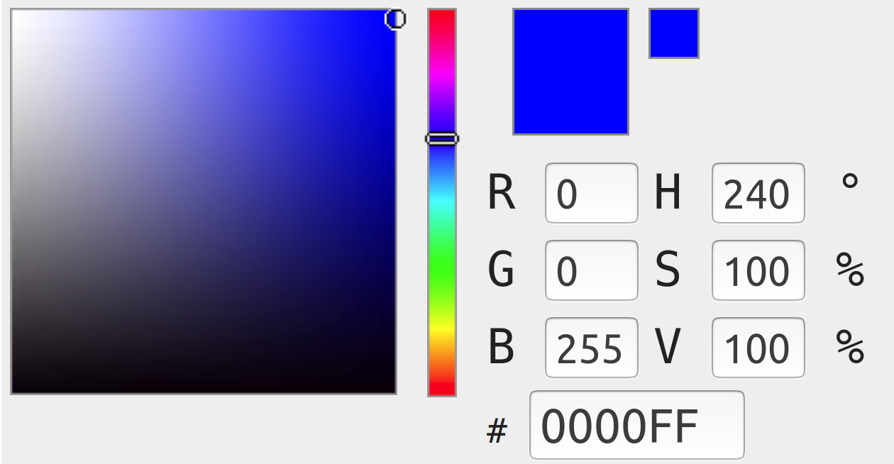
As a simple example, imagine a triptych image with pure red, green, and blue panels. The RGB values of each of these panels would be (255,0,0), (0,255,0), and (0,0,255), respectively:
 all color table images are screen captures from Rapid Tables.
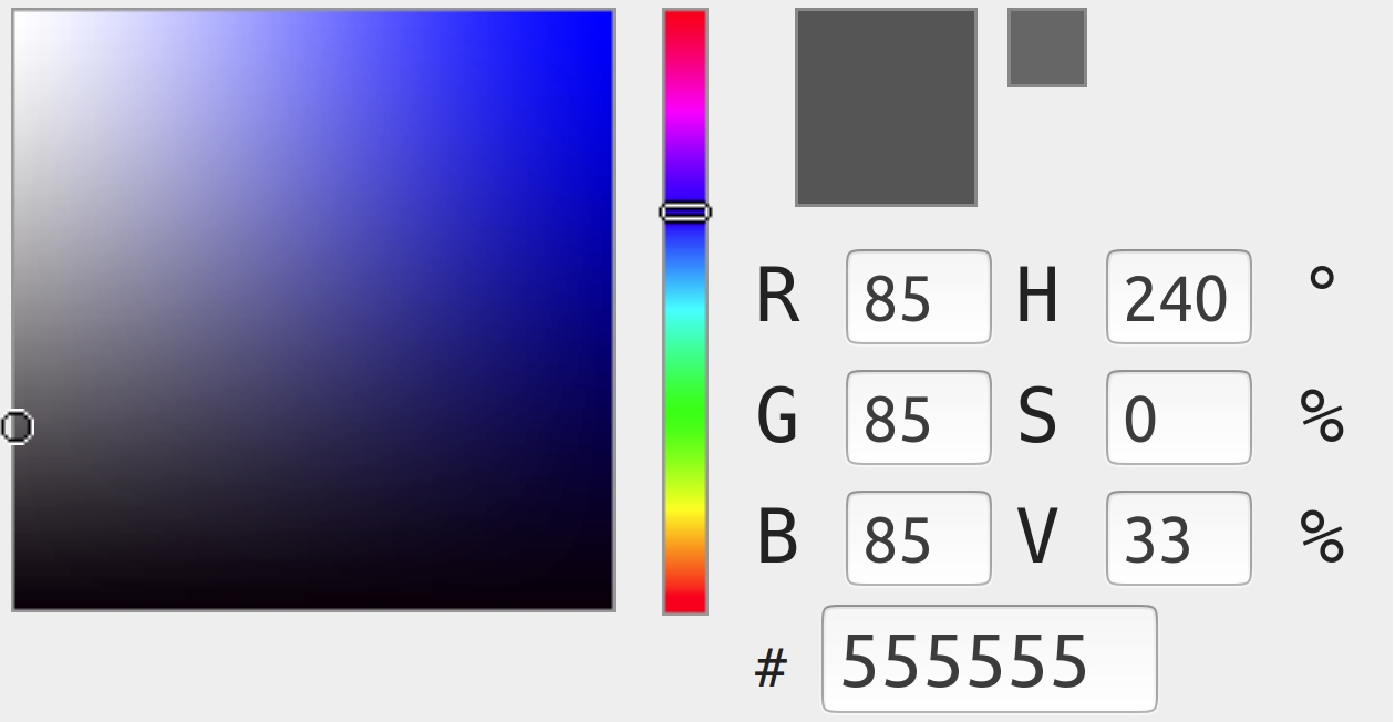
A k-means method with three clusters would yield three distinct values. Since we’re looking at a triptych with only three colors, these are the colors the k-means analysis would yield. By contrast, the average color of the image would be a combination of those three. This would be a strange greyish, purplish shade:
Clearly, the above color clusters are more relevant than the average. One potential issue is that when I eventually plot the images based on main color, each image will have a single color associated to it (and, likely, a brightness value in order to position it on an x-y axis). The color value will be the most dominant color in the image– so, it would be the value represented by the single most prominent cluster.
Since each of the colors in a triptych image (as in this example) would be equally prominent, this would be classified as just one of these clusters– for example, it would be plotted with the dominant color being pure red. This would be a bit misleading, as there’s no one color that best represents all of them. All in all, though, I don’t think this is something to be too concerned about since 1.) this seems to be reasonable and I don’t know of any better method and 2.) this particular example is very contrived; most images will have single more dominant colors.
Perhaps the more concerning cases when it comes to this issue are those in which the collection object is photographed in such a way as to not fill the frame. This is the case, for example, with 3D objects like sculptures or tableware.
A dramatic example of this is the case of this carved stone (the black border is not part of the image being analyzed, but is useful to show the edges of the images). This image has very clear components: the stone itself is a vibrant red-orange-brown, and the background is nearly white.
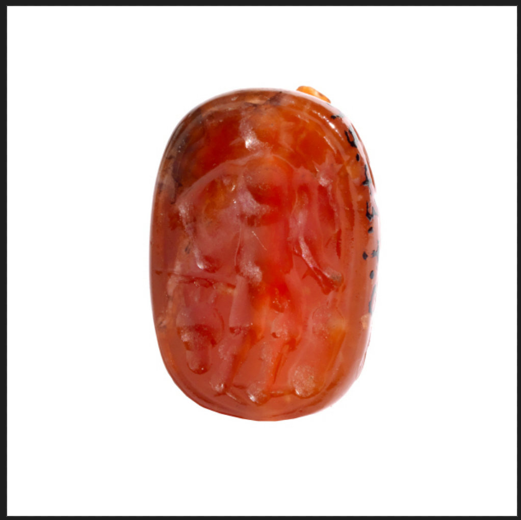 source: WCMA’s collection of object images
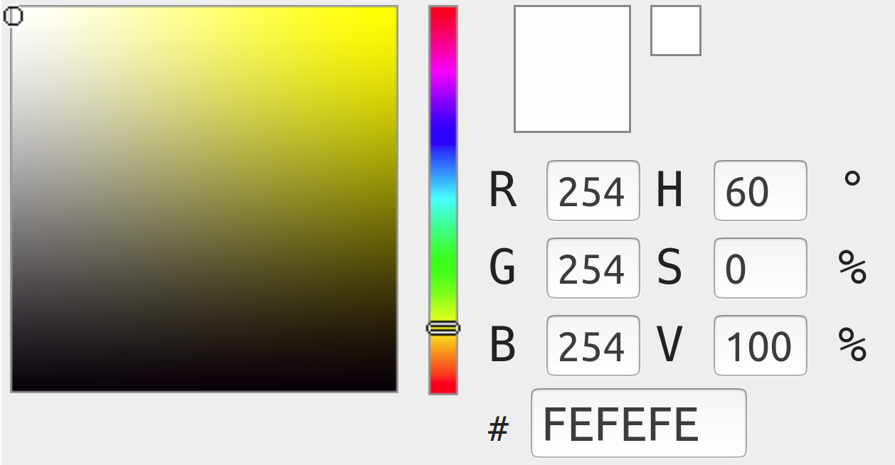
The color results of three different k-means tests are shown below, with one, two, and three clusters, respectively. Dominent colors for each test are depicted in order of prominence: the most prominent color is the one that would be linked to the image in a visualization. Outputs are in the form of RGB, which I’ve just typed into the color selector tool for visualization purposes.
One cluster: The output of a one-cluster test has the same appearance as a color average.
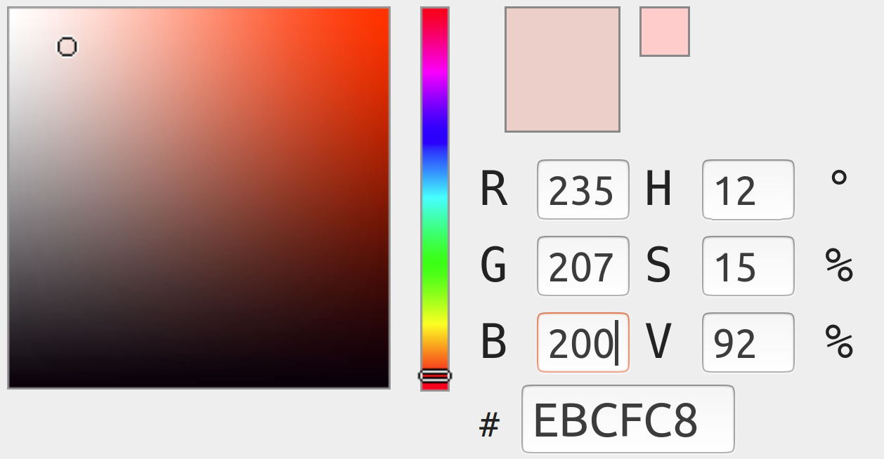
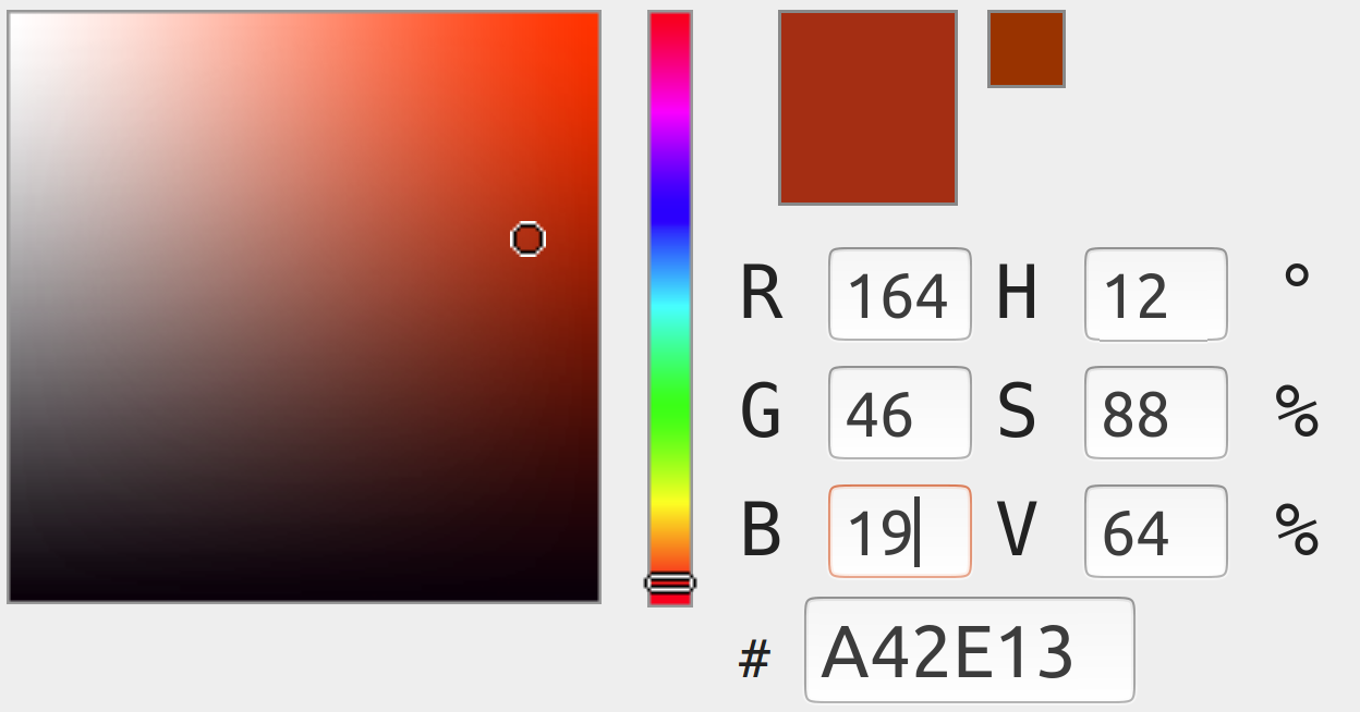
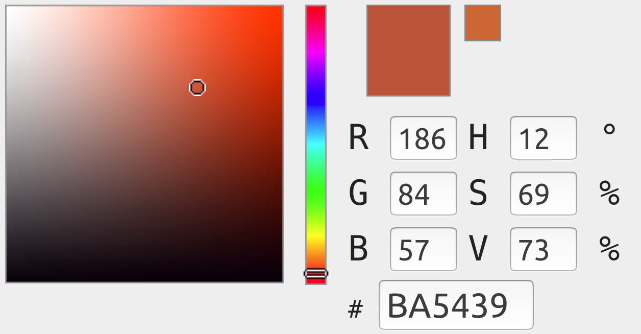
Two clusters: The output of a two-cluster test clearly distinguishes between the background and the object color.
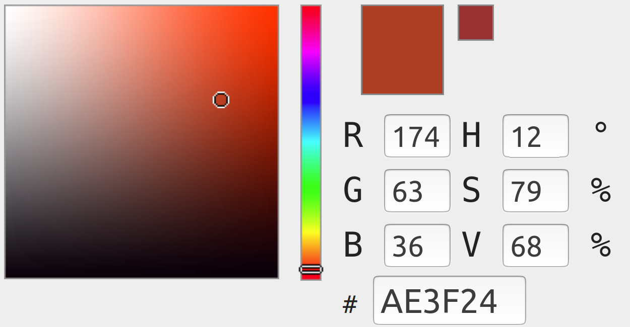
Three clusters: Similarly, a three-cluster test clearly marks the background as the most dominant color, followed by red tones from the stone itself.
It’s clear from this that a one-cluster k-means test more or less defeats the purpose of k-means, and isn’t ideal. I definitely don’t love that the background is (correctly) isolated as the dominant color here, though I’m not sure of any viable alternatives. There are enough images as to make it impossible to go through and crop manually. I considered writing a script to use the second-dominant value if the first is too close to white, but this seems dangerous considering that there likely are images for which white is actually the most prominent. This could also be confusing since not all backgrounds are white (some are dark), so we’d also be losing consistency. I’m not sure how much of an issue this is since I don’t know how many of the images of collection objects even use backgrounds in this way. Hopefully there are few enough as to make it no more than a minor inconveniece. Otherwise, I may have to revisit the issue later.