The first thing I did this week was add a brightness field to my color analysis from last week. I’m not totally sure if this will be helpful for plotting by color, but it can’t hurt to have just in case.
As a point of interest, the average brightness is ~148.891. There are 22 images whose brightness values are within a .1 range of this. Examples of images with brightnesses closest to the average include:
I’ve also been starting to think about my final visualization, while working on some other static d3 visualizations with my cleaned data. These are a step up from the test data I’ve used in the past, but just because it’s been a bit harder to debug issues, and I’m trying to make it look more ‘presentable’ than I was before.
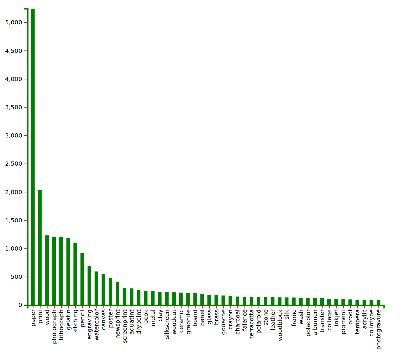
Here, for example, is one showing the most commonly used mediums. This data was from the ‘mediums’ field of the collections data. Since many entries in this field were fairly verbose, and thus more likely to be unique, I broke down the field entries into words, removed endings that did not modify meaning (e.g. “books” became “book”), and recorded the frequency of each term. I removed values that were unambiguously modifiers rather than mediums, but did not remove cases where the meaning was potentially ambiguous. For example, a word like “yellow” was always an adjective describing something else, such as “pigment” or “paper”. In these cases, “yellow” could not possibly be a medium itself, so was removed. The ambiguity comes with words like “silver”, “gold”, etc. These terms were left in, as they could either be modifiers (as in “silver paint”) or materials (and thus mediums) themselves, e.g. if a platter was made of silver. So take the count of those mediums with a healthy grain of salt– but the main takeaway is clear: there’s a lot of paper.