We’ve done it! Read on for a walkthrough, or just check it out here.
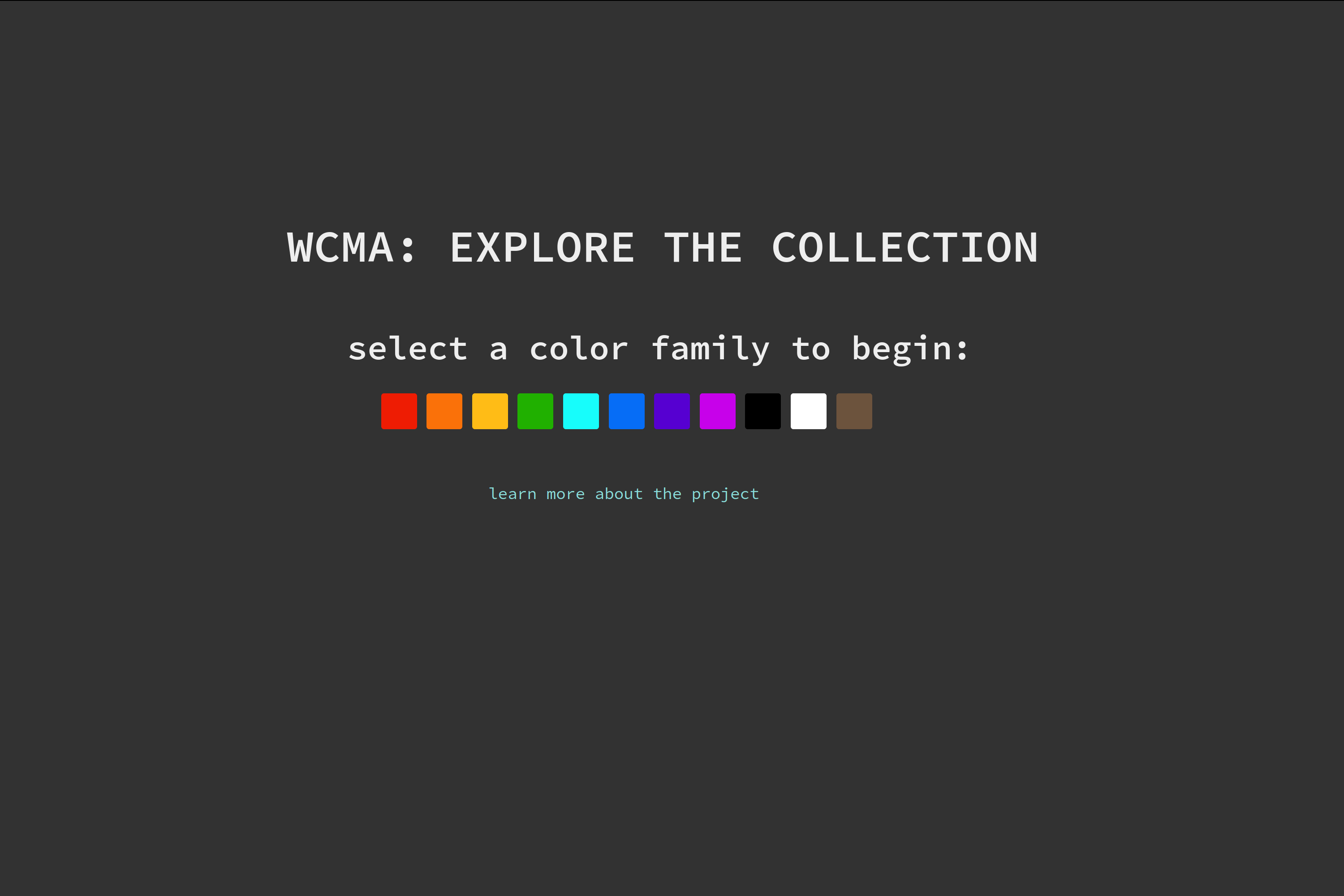
homepage
We start with this, the main homepage. It links to all available color families, as well as a descriptive overview page.
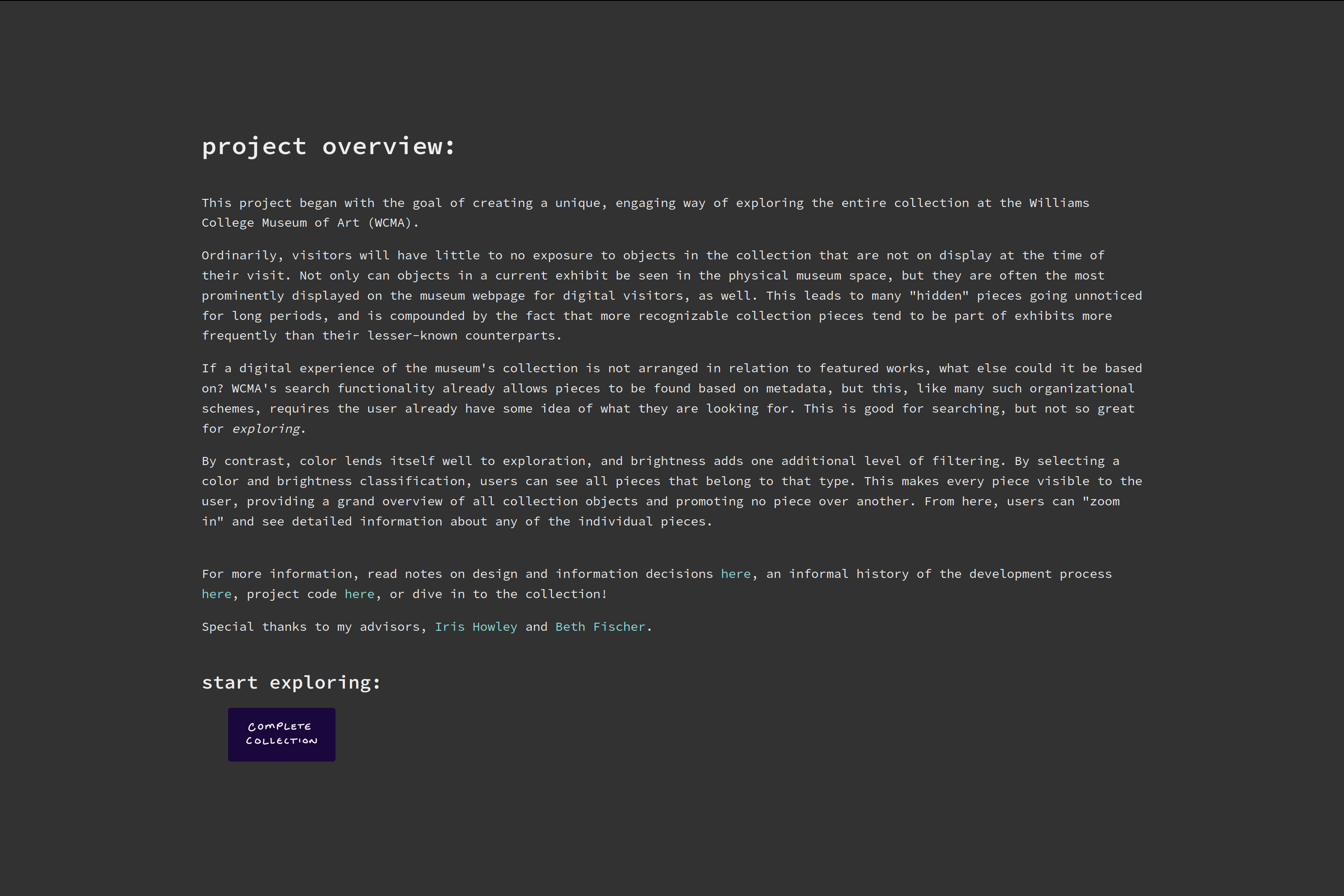
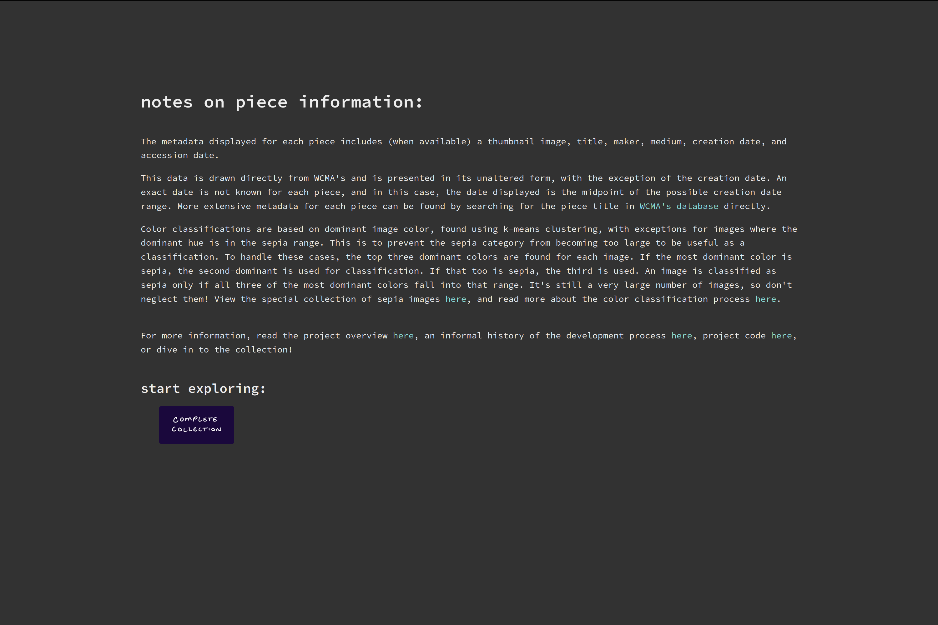
informational pages
The first page shown here is the overview page, which is linked to from the homepage. The overview page has several supplementary links, including the second page shown here. This ‘notes’ page gives more information on the information available for each image, as well as a brief description on how the image classification was handled.
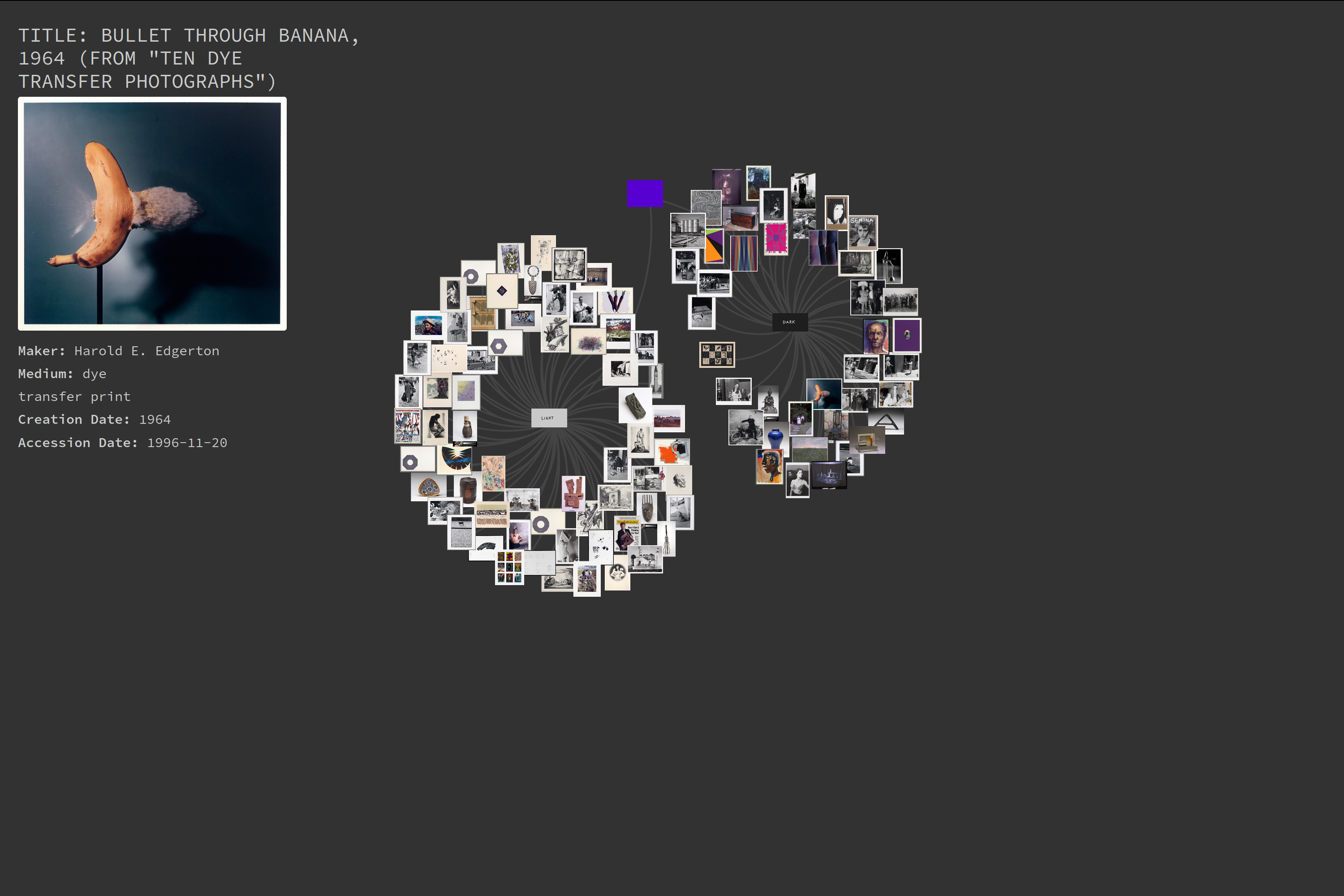
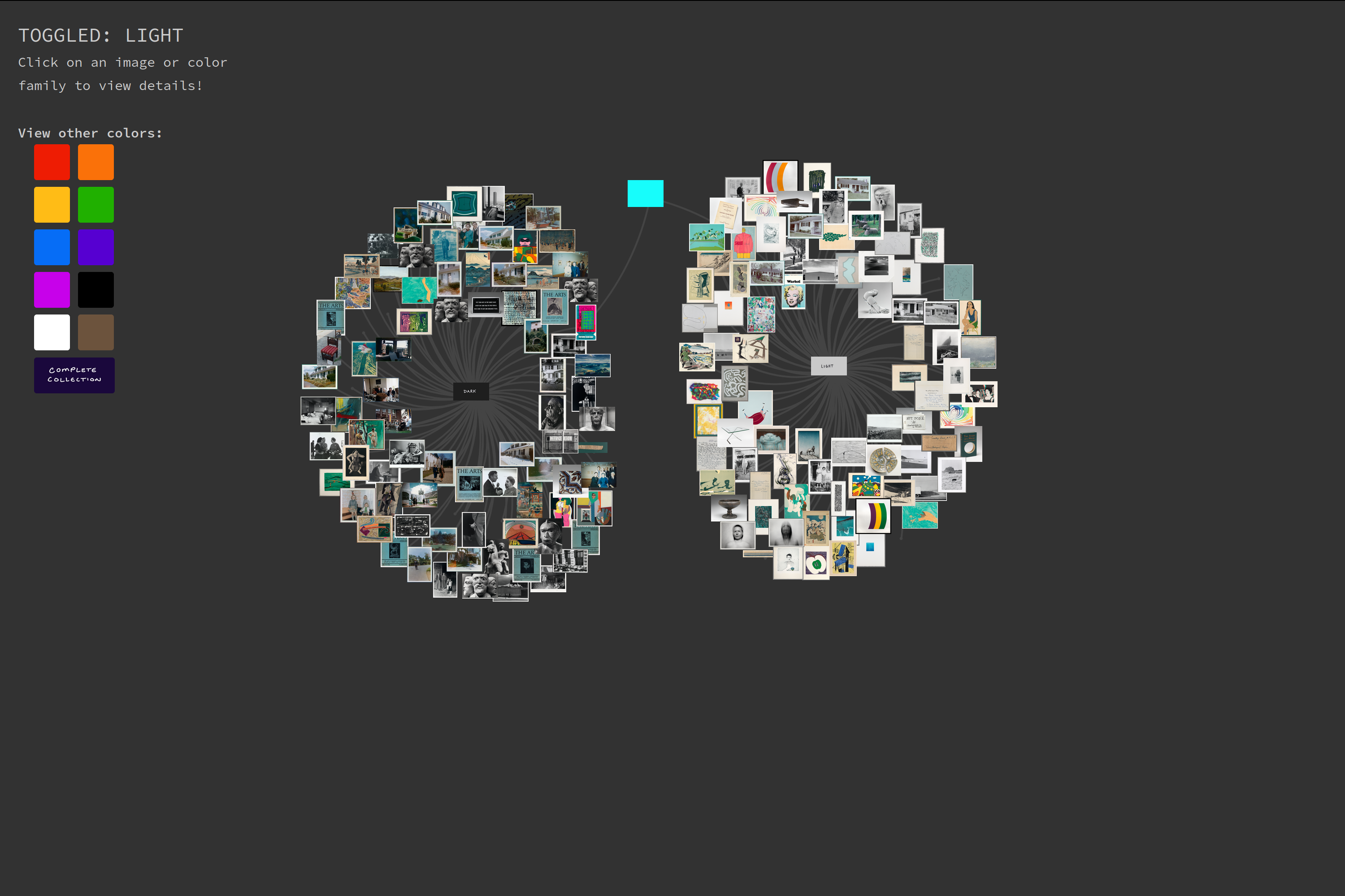
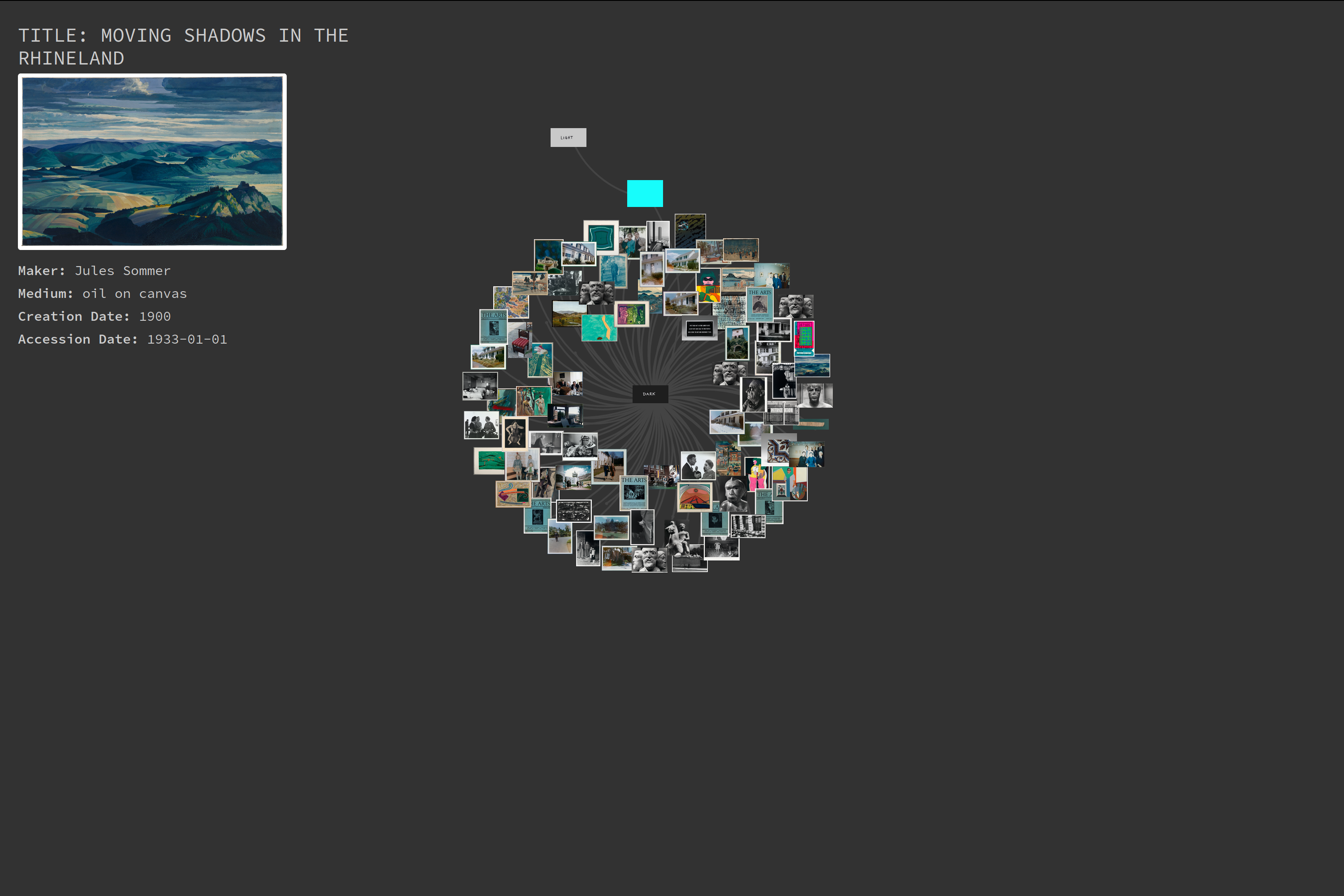
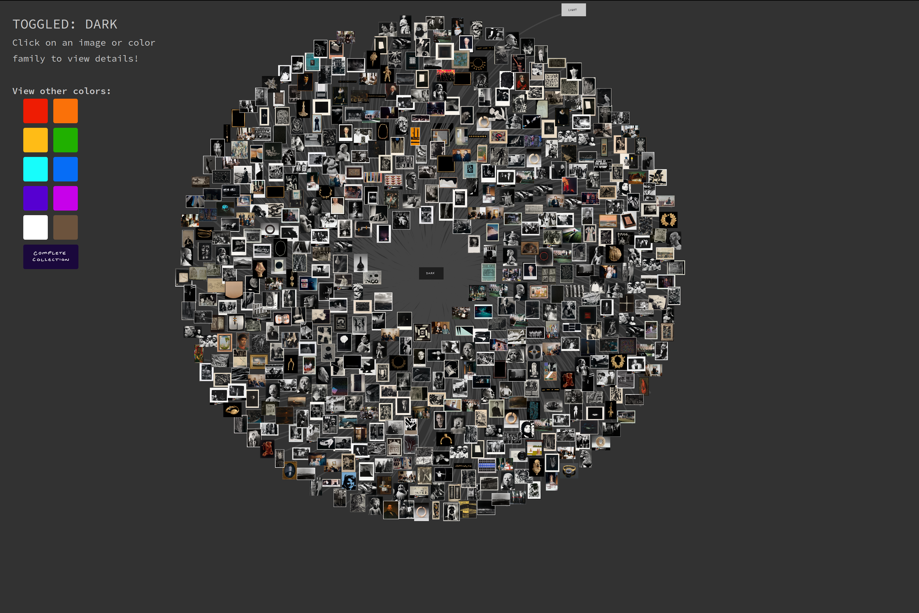
main color pages
The color pages are the most fun, and of course, these are the heart of the visualization. Each color category is subdivided into two components: light and dark images. Clicking the ‘light’, ‘dark’, or color tag (central node) toggles the visibility of the component and makes the color selection menu visible. Some examples at different stages and sizes:
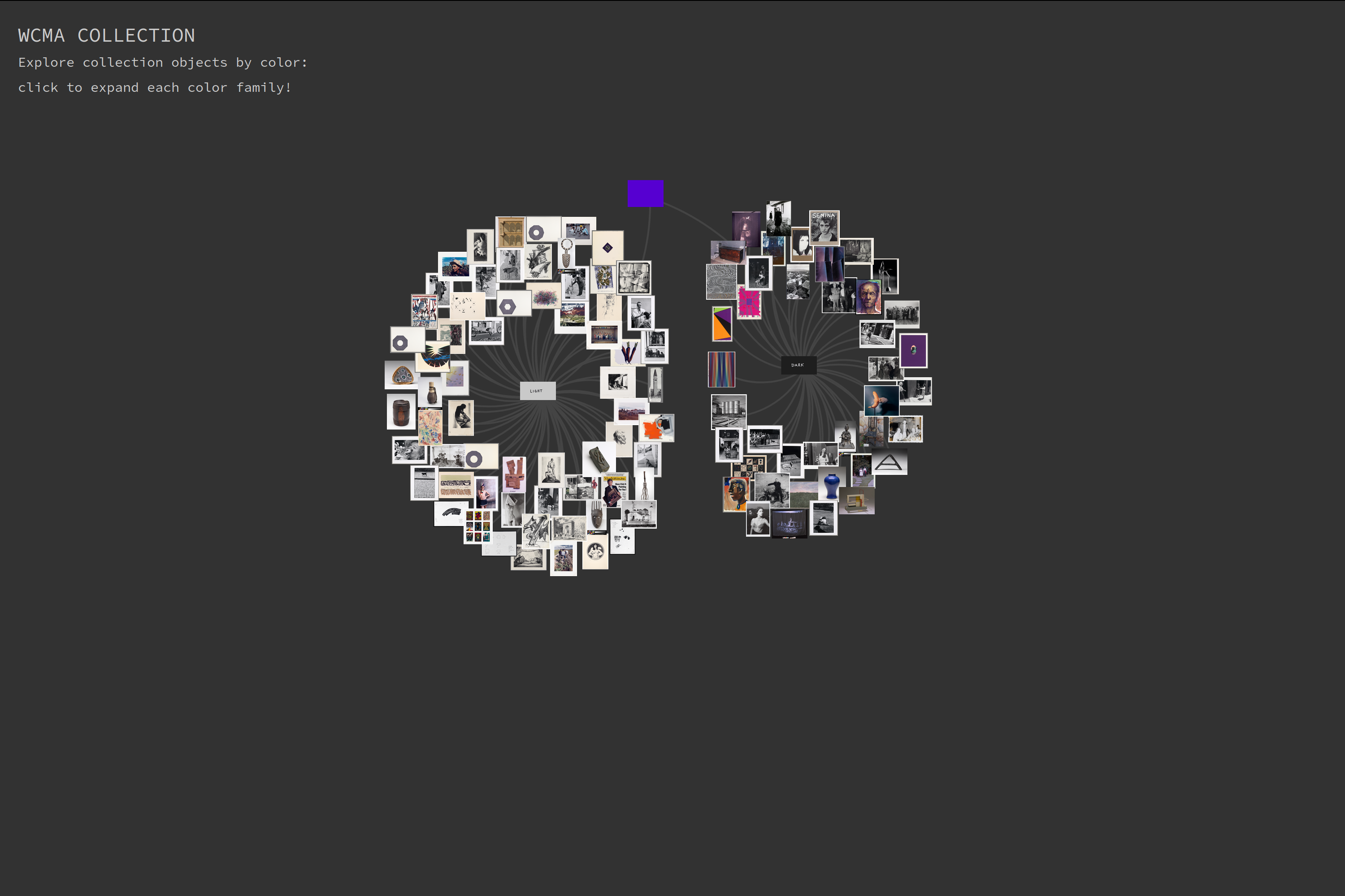
Credit and thanks to the work of Mike Bostock, Sundar Singh, and Paul Brady –a combination of these works formed the starter code for this portion of the project.
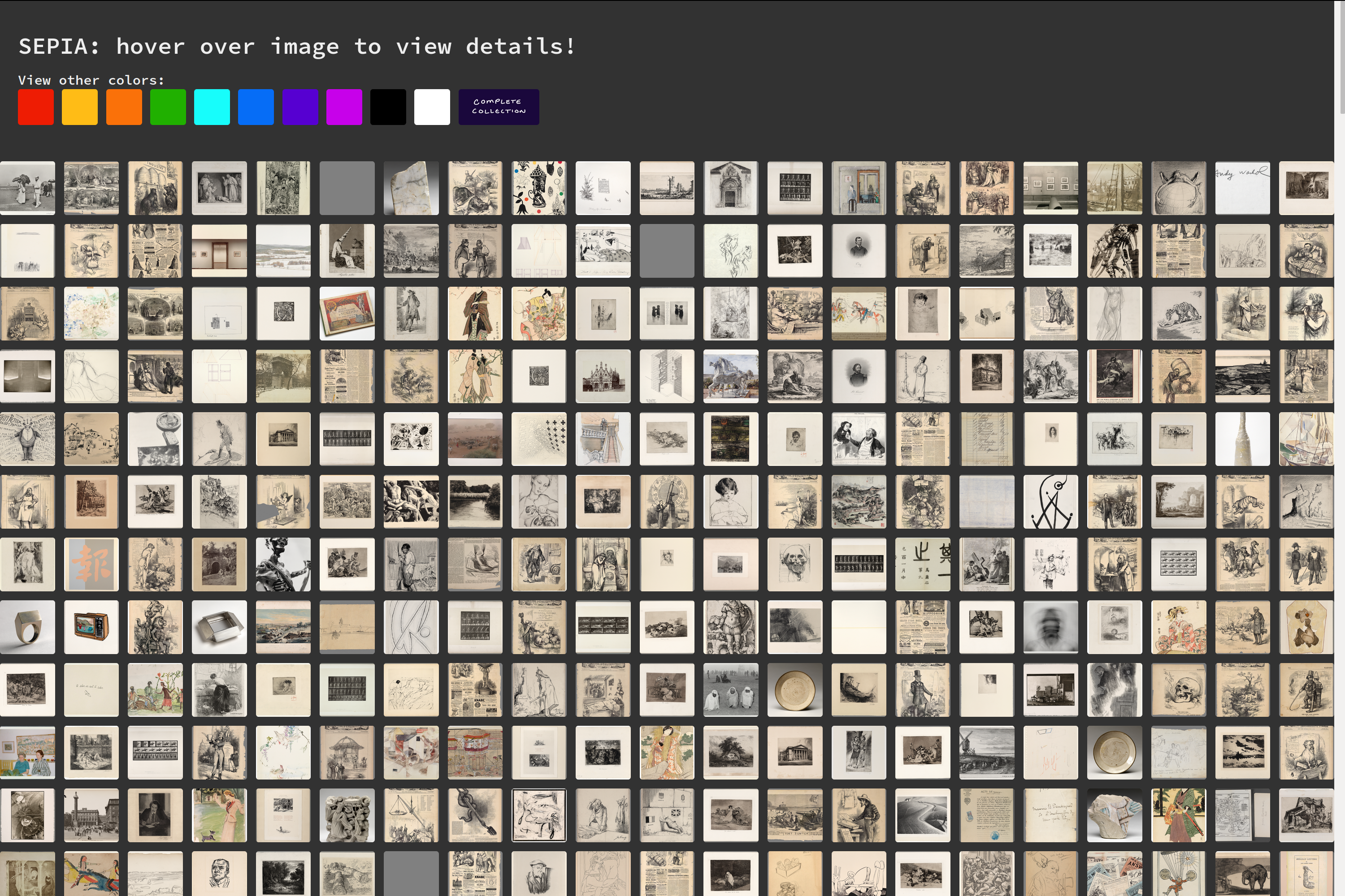
special sepia layout
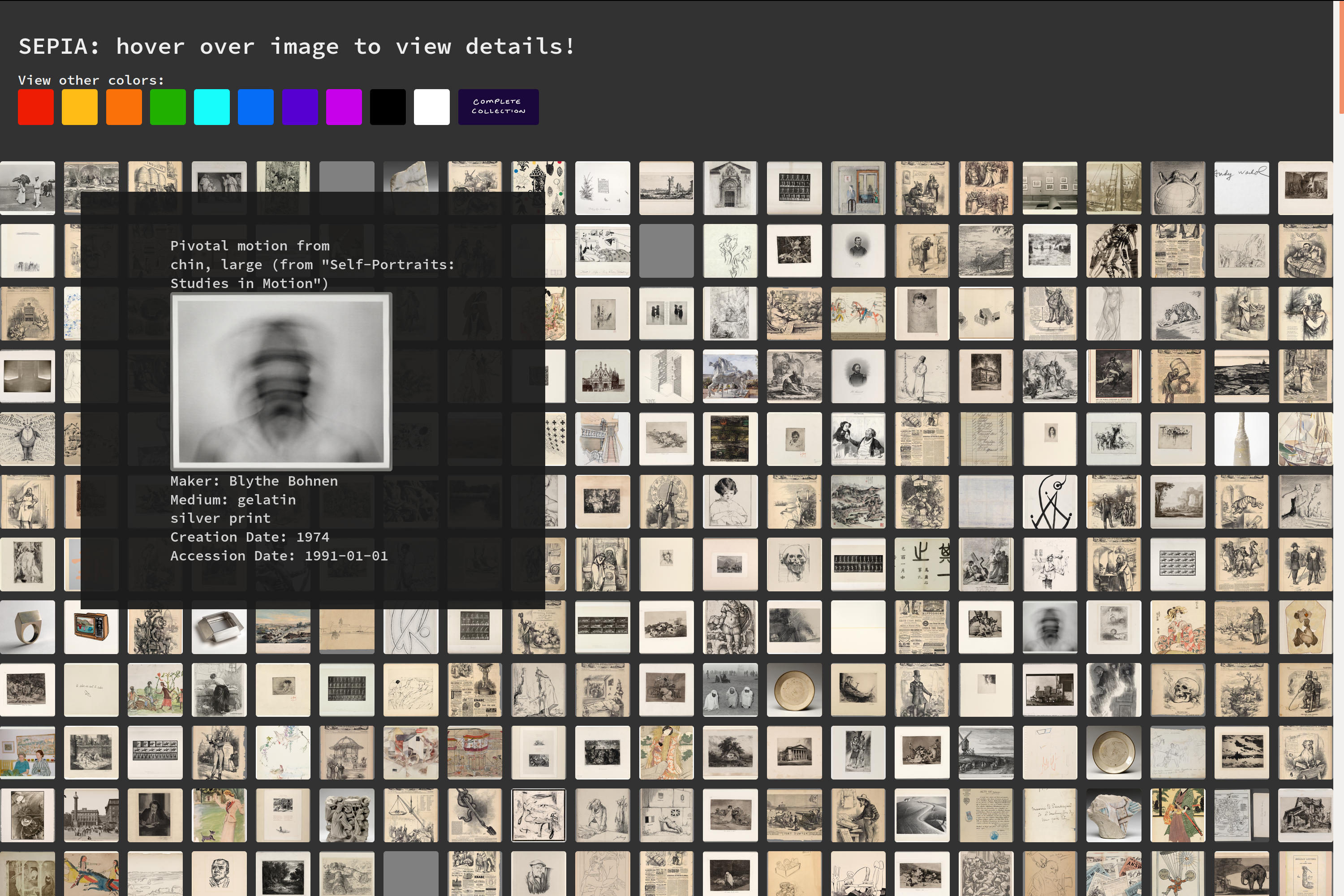
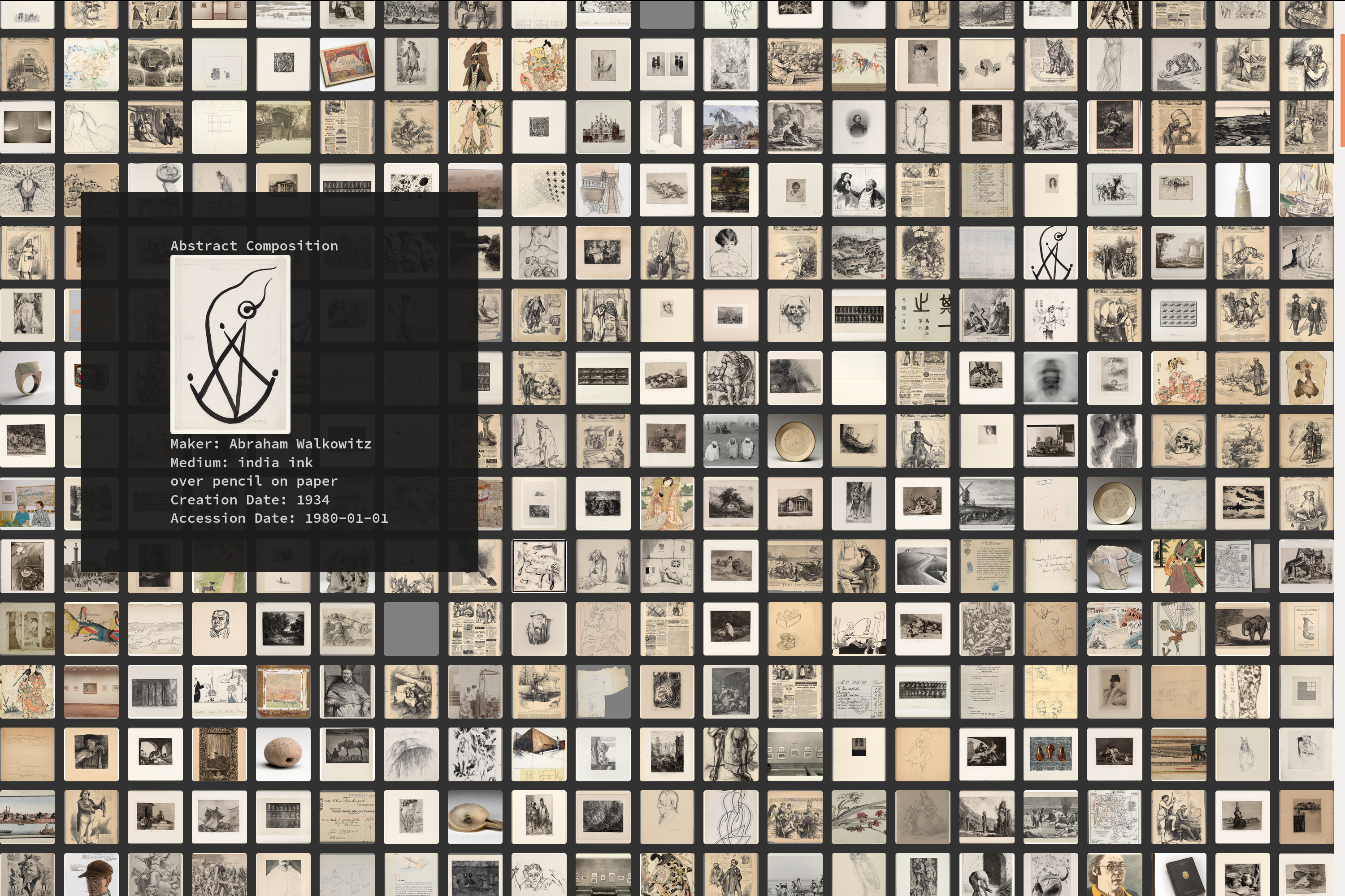
When you hear ‘sepia’ you might not think ‘special’, but I had great fun with this portion of the project layout. Even after severely limiting the constraints for sepia classification, there was still an overabundance of pieces (for details on the classification process for this color range, read the overview page shown above). There were too many images for a graph, so I opted for a grid layout instead– and note the size of the scroll bar! The header contains the nav links, and detailed piece information is shown when the user hovers over each image.
Thanks to Andy Barefoot’s Medium post for a tutorial on D3 grid basics.
reflections
Overall, I’m pretty pleased with how this turned out, and I’m happy with this as a first attempt at info vis and the d3 library, not to mention my first real go at html and css. That said, there are two main things that are really bothering me about the main (graph) color pages, and that hopefully I’ll be able to fix in the future: the lack of dynamic sizing and the fact that the graph is fully expanded when the page loads.
The former is an issue on any screen that differs from the size of my laptop (yikes). The second matters on the larger color categories, but not the smaller ones. It’s troubling. So, there’s more to come!
Update: 12-14-19
Dynamic sizing works, yay! New problem after hosting though, the loading time is not good. Yikes.